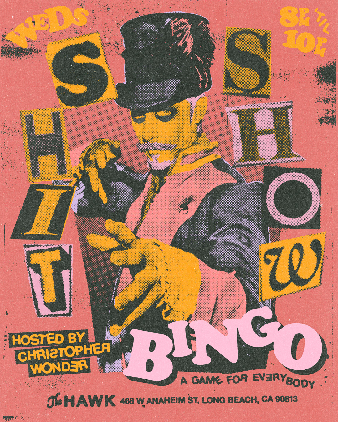
THE HAWK
My buddy Kyle runs one of the best bars in Long Beach, The Hawk. He and I had talked shop about design a few times at the bar, and was excited to see how I could help.
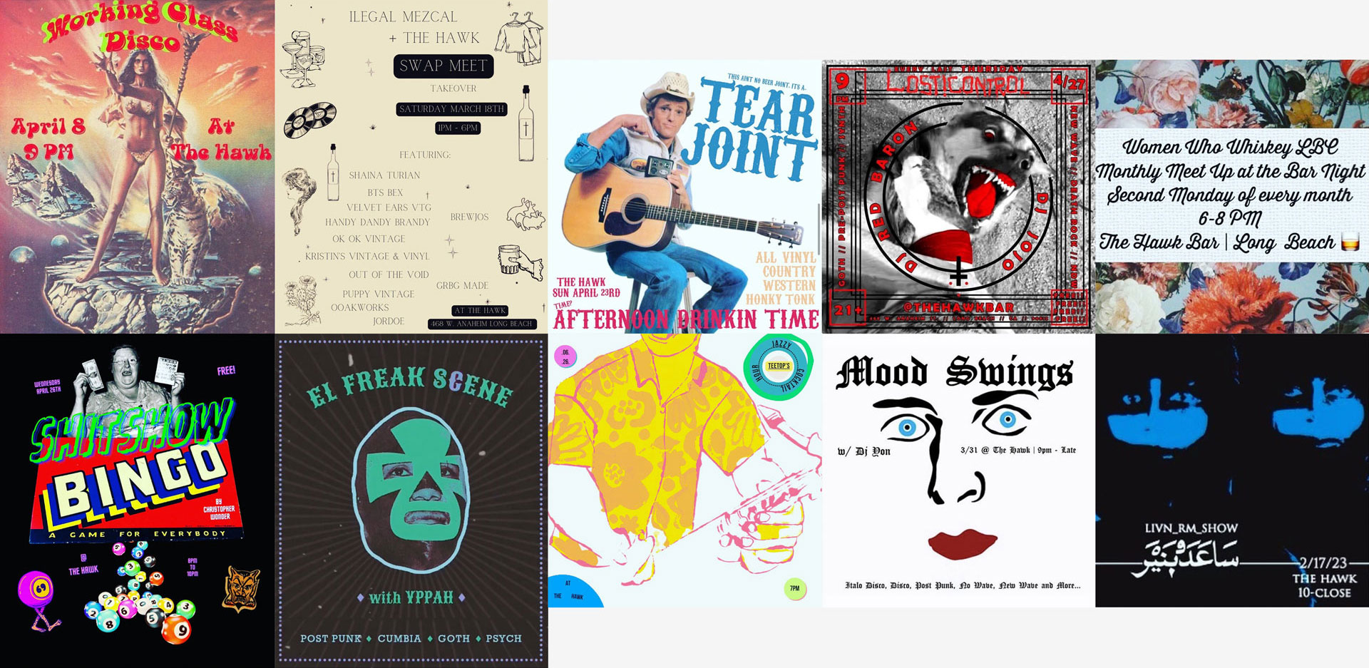
I did an audit of the bars Instagram presence and noticed that each post had it’s own individual aesthetic; there wasn’t any consistency in regard to aspect ratios; and in general lacked strong visual cues that tied the posts back to the bar.
Essentialy they just didn’t immediately read “The Hawk.”
I did an audit of the bars Instagram presence and noticed that each post had it’s own individual aesthetic; there wasn’t any consistency in regard to aspect ratios; and in general lacked strong visual cues that tied the posts back to the bar.
Essentialy they just didn’t immediately read “The Hawk.”
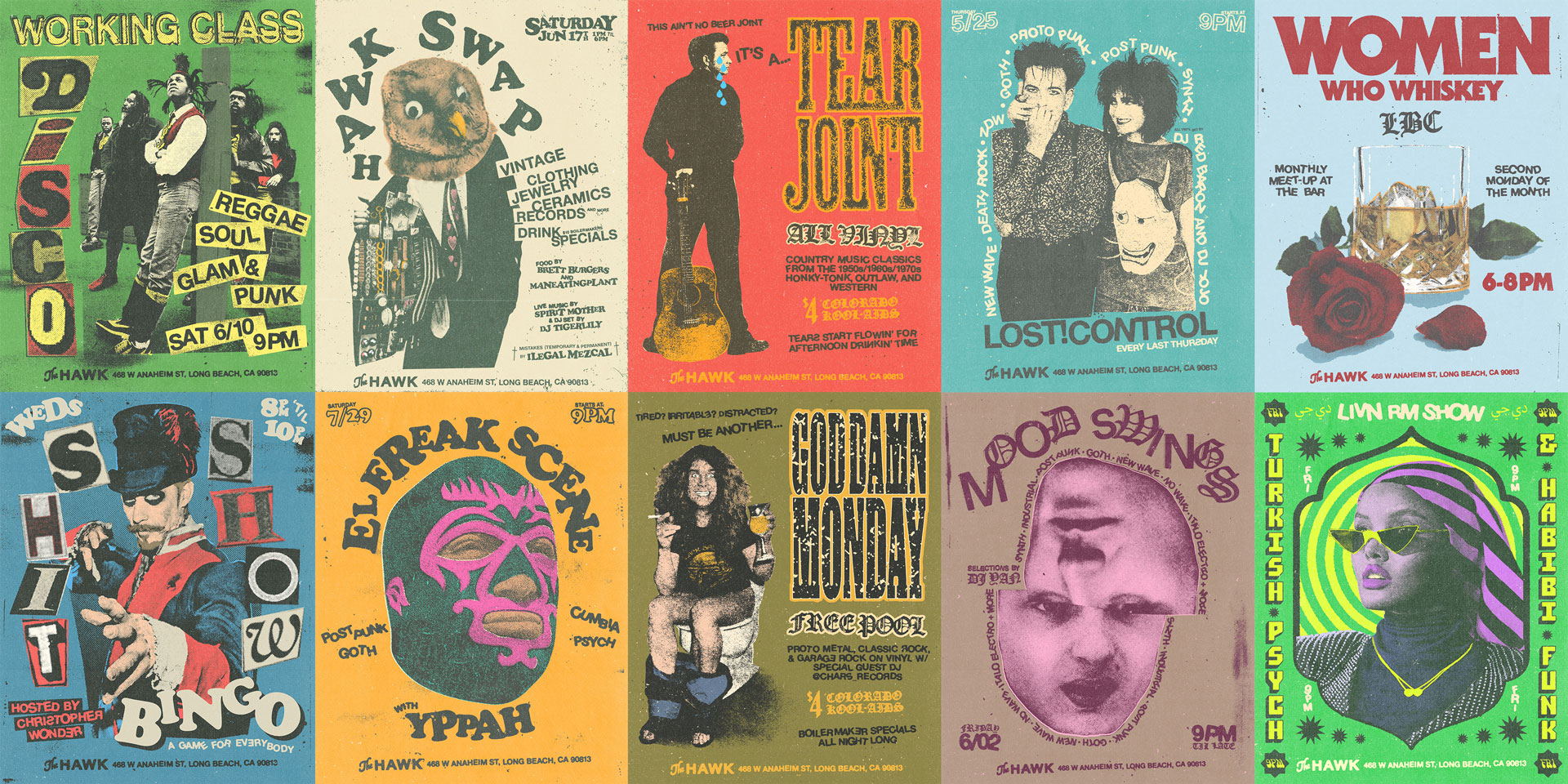
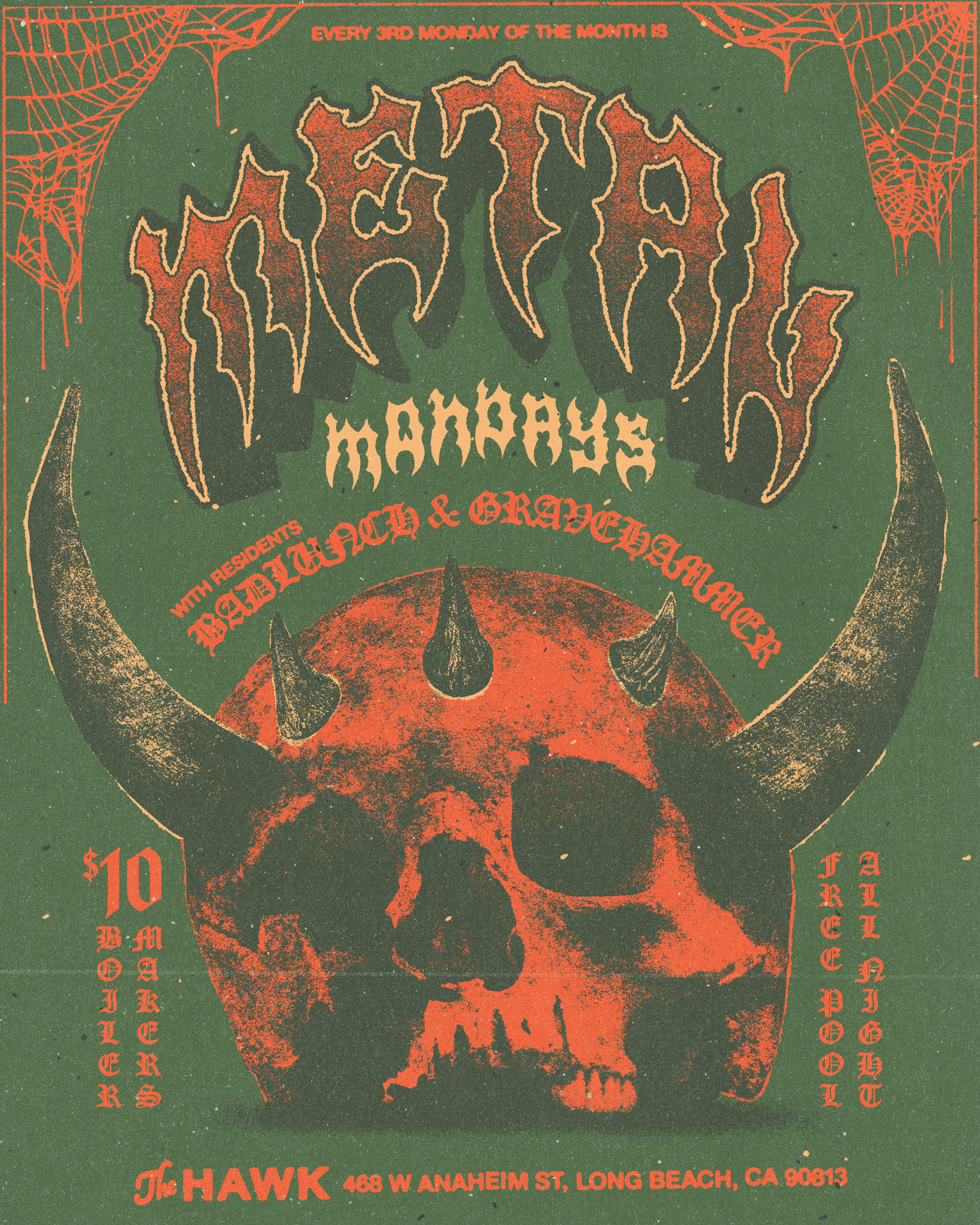
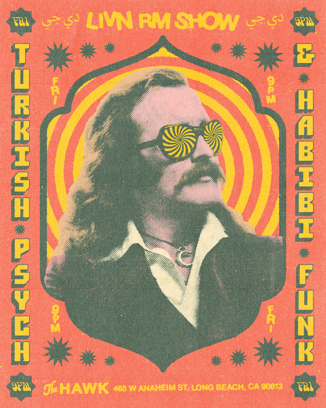
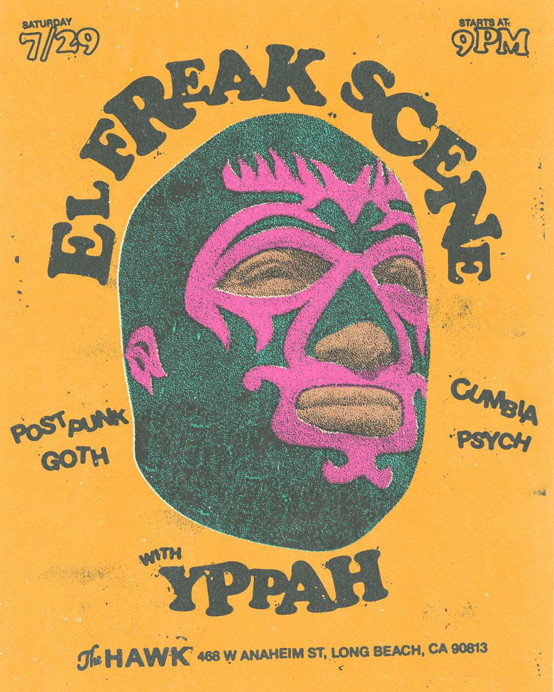
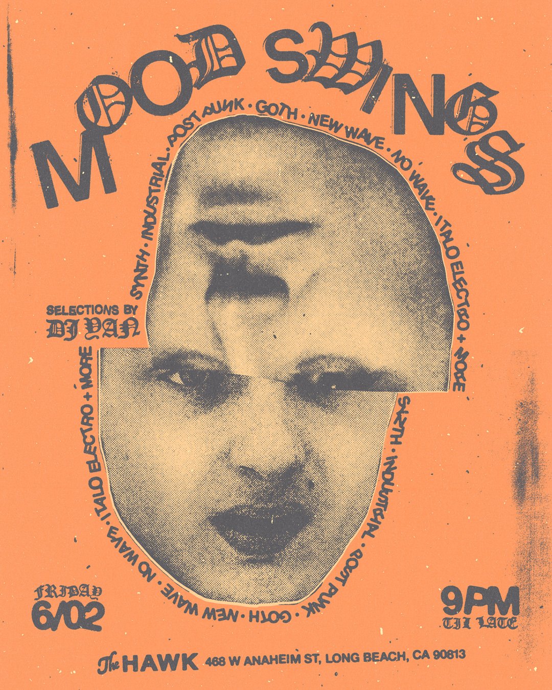
I developed a design identity that incorporates a flexible type system to allow for variety; clear and consistent bar presence in every post; and a visual treatment that makes every post feel cohesive.
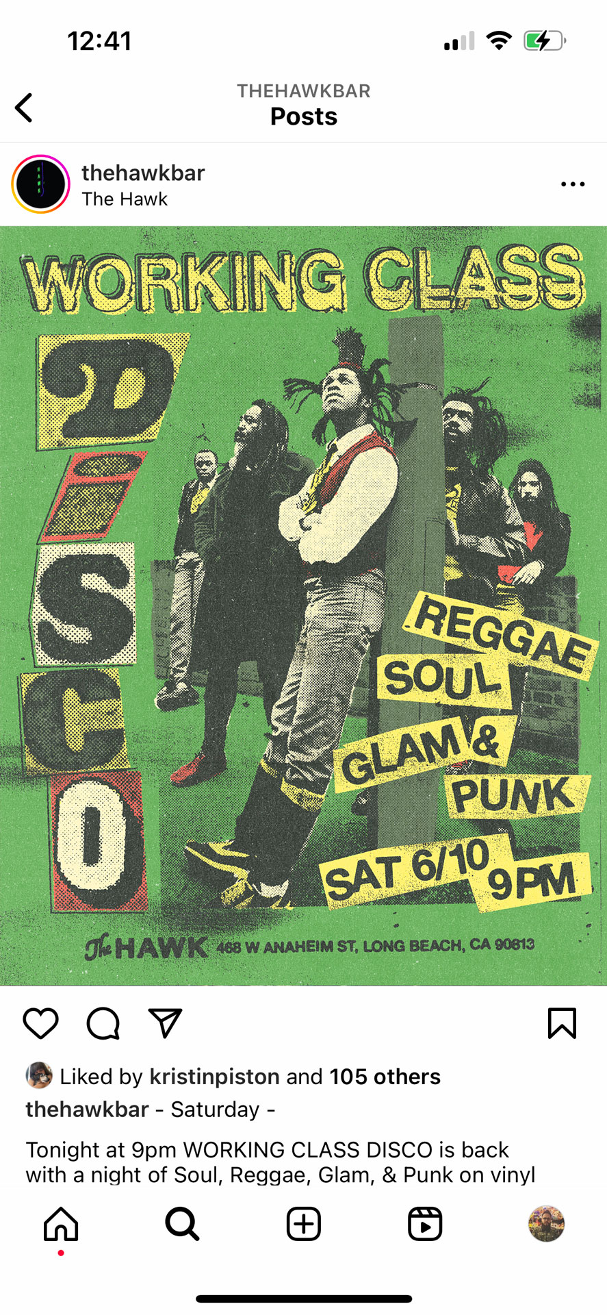

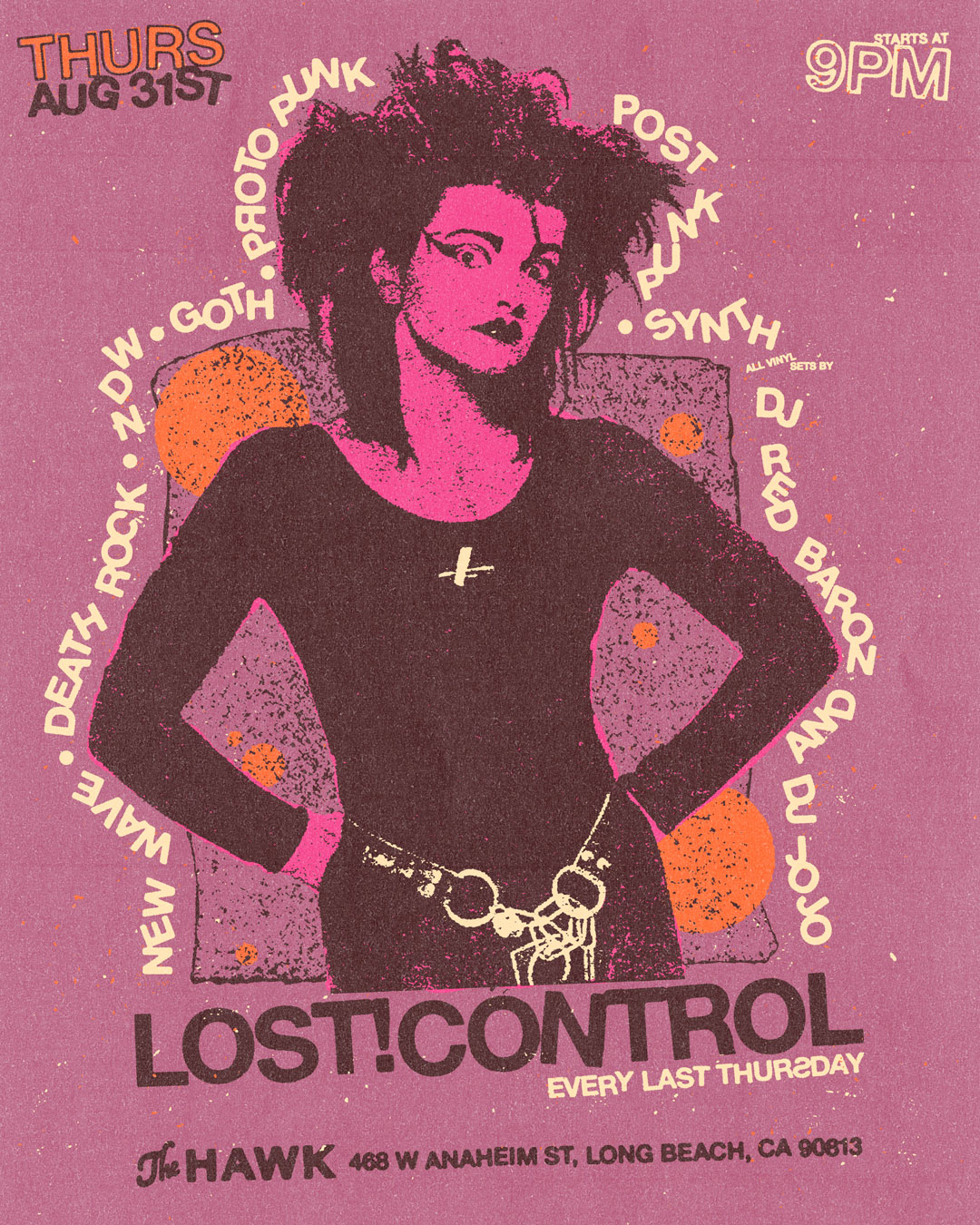
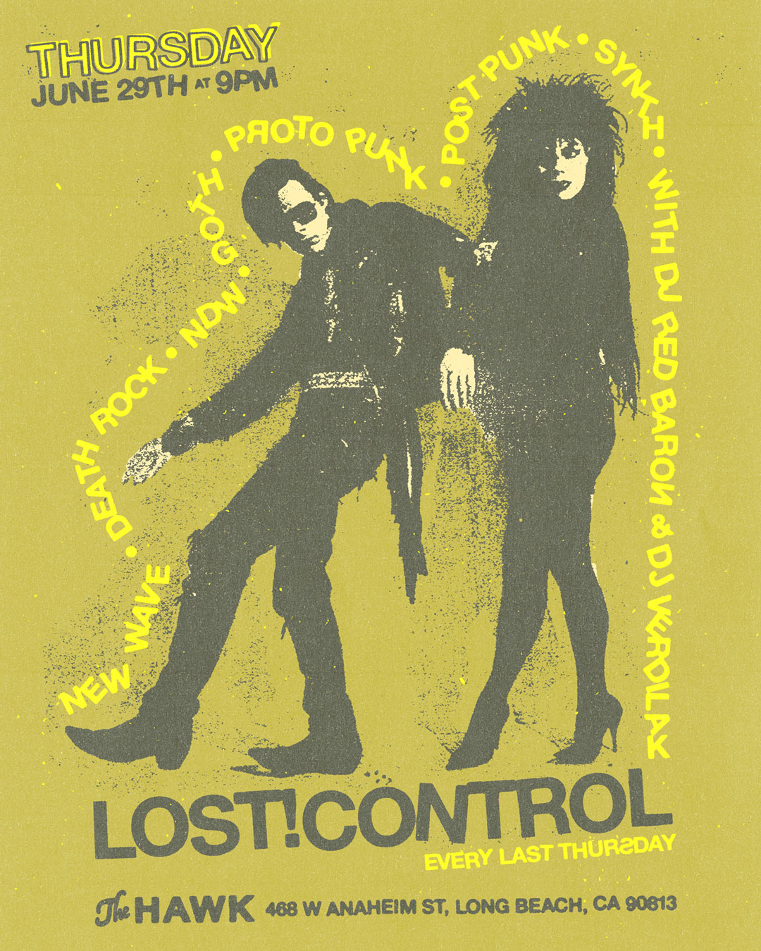

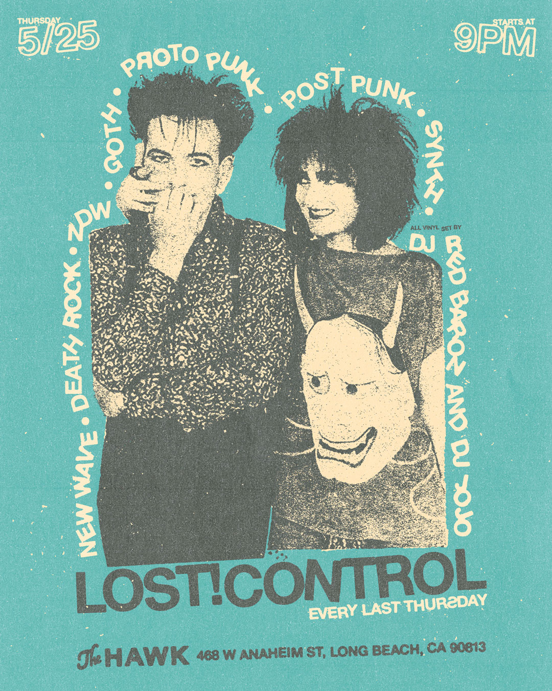

Multiple designs were created for each specific night’s theme/DJ; typically a monthly event. A broad but cohesive palette so there’s plenty of opportunity when creating new designs.
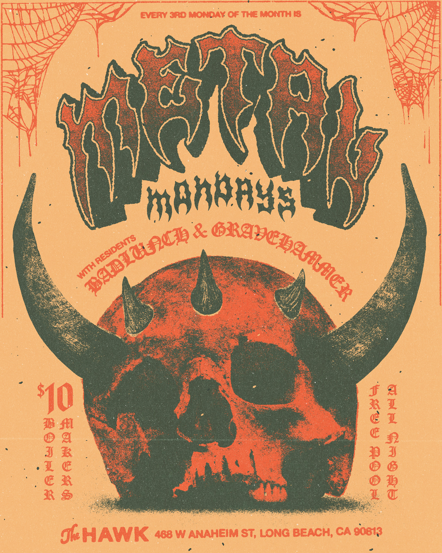
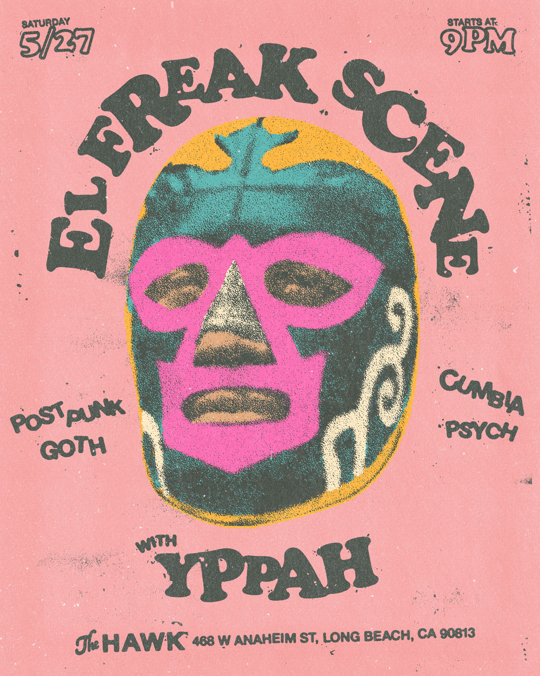
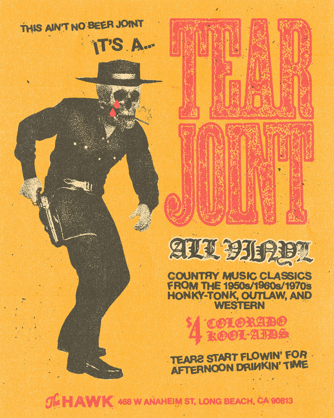
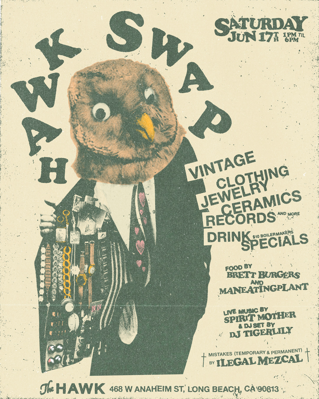


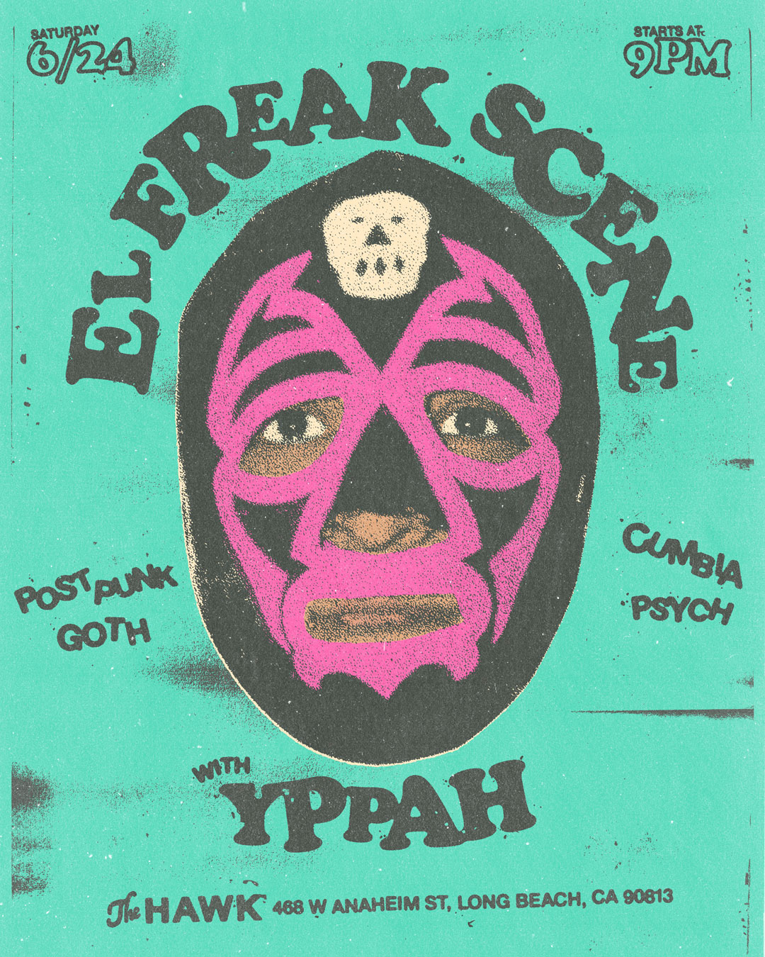

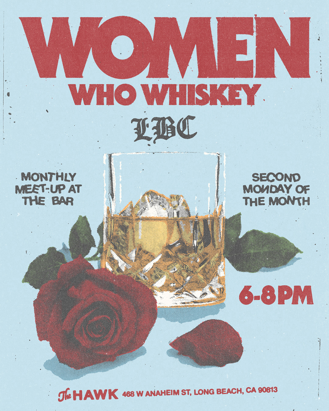
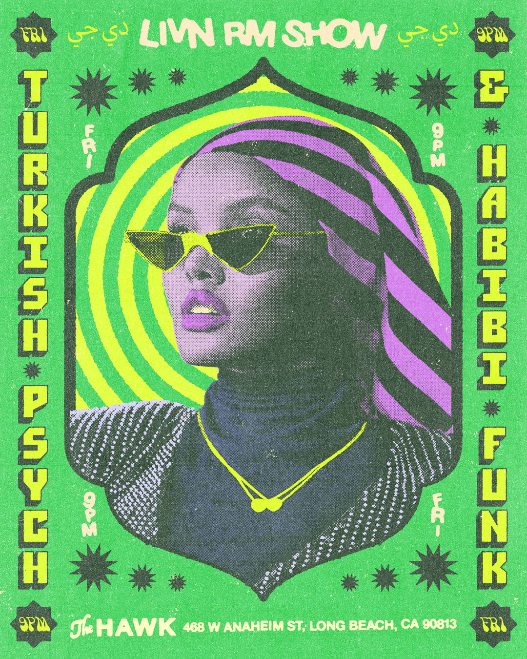
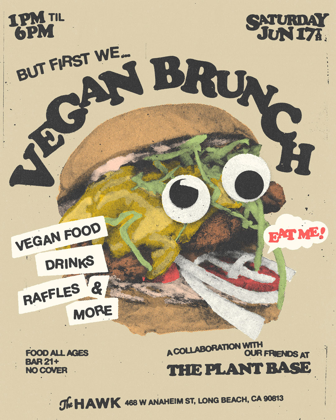
The visual treatment and texture not only ties all the visuals together, it also speaks to the bar’s musical curation. A lot of music from the 60s, 70s, 80s, and 90s with roots in punk, post punk, and college rock. The treatment is inspired by flyers from those eras.

